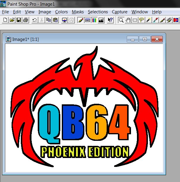
I like your phoenix logo, @Pwillard! Very clean. I like how QB64 is surrounded by the wings. I messed around with it to make a suggestion.
Here's my 2 cents opinion on a logo. The phoenix image is very tall, not good for some applications, like a website banner or icon for example. The bird takes up most of the real estate, no good way place text because of that. How about making the wings go down like it's protecting QB64 from the flames, and that will square up the image some and make a nice center spot for the QB64 name.
Something like this for example (Hope it's OK @Pwillard I played around with your Phoenix to explain my thoughts...). Sorry the image quality is so crappy...(heh what do you expect for 2 cents...)
- Dav


